 by Addie Van Salisbury on Jan 7, 2021
Happy New Year! And happy fresh year of statistics! The great news is that Aspen Discovery has a lot of built in statistics capabilities and with the most recent release there are even more!
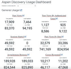
Usage Dashboard
In System Report there is Usage Dashboard, which includes basic usage of Aspen. This tells us things like page views, page views by logged in users, sessions started, and the type of searches patrons are doing. The usage dashboard does break up the searches into resource based counts.
Resource Specific Counts
Within ILS integration, in the dashboard you can see how many patrons are logging into Aspen, submitting requests, and interacting with cataloged records. In individual modules for e-resources or other search sources you have enabled, you will also see dashboards for those.
The modules you can currently expect to see a dashboard for in addition to ILS integration are Axis 360, Cloud Library, EBSCO EDS, events, genealogy, Hoopla, Open Archives, RBdigital, side loads (manually loaded in Marc records), and website indexing. Each of those sections in the Administration Menu, if enabled in your Aspen Discovery, will contain a dashboard with statistics on how frequently patrons are interacting with those collections or resources.
New Statistic Capabilities
In the release of 20.18, there are so many improvements to statistics. If you are a consortia or multi-branch system using Aspen Discovery you can now sort your usage statistics to show you the data specific to your branch or any branch you are interested in. All you have to do is click the dropdown next to 'Instance to show stats for' in the usage dashboard and it will give you a list of all of the urls in your Aspen Discovery system to choose from.

You can view general usage in graph form on the specific things it is tracking or you can compare all general usage to one another by clicking the graph symbol next to 'General Usage'. You can compare different types of searches, as well, by clicking the graph symbol next to 'Searches'. This is a super neat functionality because it will show you how often patrons are using your different resources that they can search within Aspen, including catalog searches, lists, EDS searches, website searches, Open Archives, events, and genealogy.
These visualizations will help you to get an understanding of how patrons are interacting with your different collections in relation to one another, as well as seeing trends in how patrons are interacting with your catalog.

Graph Tip
I like to exclude 'grouped work searches' from the graph to see how my other resources are getting used by patrons because we know the catalog searches will be way more than others! You can do this by clicking the 'Grouped Work Searches' above the graph and it will exclude that data.

What Else Can I Do?
When you are looking at graphs in the usage dashboard, there is also a raw data table under the graph that gives you the numbers for the information you have asked Aspen to graph for you. You can take that raw data and manipulate it further through your own graphs or pivot tables. This way you can explore any trend. All you need to do it copy and paste into an excel file and get to playing.
Read more by Addie Van Salisbury